

My MINI Cooper 2-page spread magazine advertisement
#26
 04-06-2009, 08:50 AM

#27
04-06-2009, 09:11 AM
#28
04-06-2009, 09:17 AM

4th Gear
Join Date: Aug 2008
Location: San Jose, CA
Posts: 354
Likes: 0
Received 0 Likes
on
0 Posts
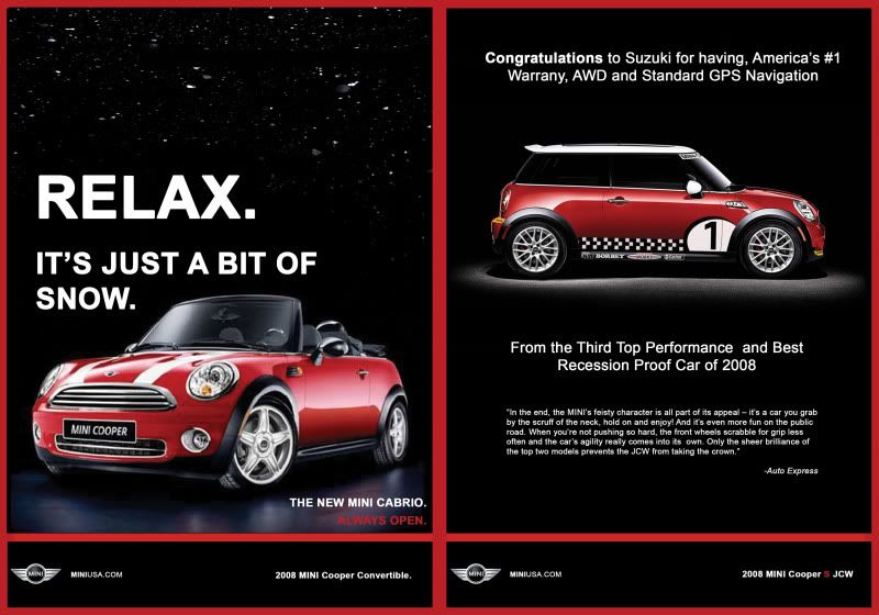
I don't know, There is still something about the JCW side ad. Congratulating Suzuki at the top then say third performance car just does not make me want to go get a MINI. Tells me the Suzuki is a better car (though I know better). I see because you don't mention the 2 better performance cars I would be led to believe the Suzuki is one of the 2 above MINI and i should go check out the Suzuki. I would get rid of the congradulating Suzuki and put at the top that the MINI is in the top 3 performacnce cars only behind the Porsche and Nissan GTR at half the price (or whatever it is) as my grab line.
Just my opinion.
Just my opinion.
#29
04-06-2009, 09:45 AM
#30
04-06-2009, 09:49 AM
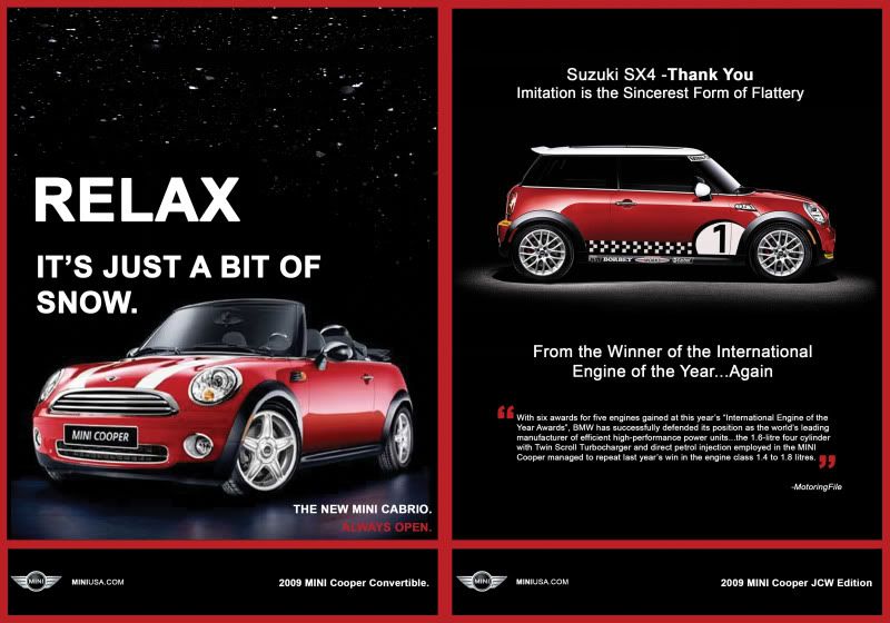
Should I stick with the old "Congratulations" quote or the new "Thank You" quote. I think the old congratulations quote would make a better pun...
BTW does anyone know how to get out the ruler tool? I remember someone in my class using this blue line as a straight edge on photoshop to align pics and text. I def. need to align some texts and etc. Forgot how he did it...
BTW does anyone know how to get out the ruler tool? I remember someone in my class using this blue line as a straight edge on photoshop to align pics and text. I def. need to align some texts and etc. Forgot how he did it...
#31
04-06-2009, 09:58 AM

6th Gear
Join Date: Jul 2008
Location: St. Louis
Posts: 1,589
Likes: 0
Received 0 Likes
on
0 Posts
#32
04-06-2009, 10:01 AM
#33
04-06-2009, 10:10 AM

In any market segment, I'm not aware of a single case where the #1 ever makes reference to the #2.
In the small car space, there are a zillion wanna-bees, but there's only one Mini! (IMHO)
#34
04-06-2009, 11:19 AM
#35
04-06-2009, 01:36 PM

They come pretty close to it in their latest "Lauren" ad, where Lauren initially walks into the Apple store and walks out claiming she's "not cool enough to own a Mac". The acknowledgement was quite a surprise because as you say
Normally when you're the leader, and you have the superior product, you don't even want to acknowledge that you have competition.
#36
04-06-2009, 01:46 PM

OVERDRIVE
I'm not sure I get the point of the "Lauren" ad. Microsoft is a software company, but the ad focuses on Lauren choosing an HP laptop over an Apple laptop for her needs, as if Microsoft is somehow responsible for the fact that HP makes a 17" consumer-grade laptop and Apple doesn't.

#38
04-06-2009, 02:28 PM

2nd Gear
Join Date: Dec 2008
Location: Ohio
Posts: 58
Likes: 0
Received 0 Likes
on
0 Posts
#39
04-06-2009, 02:28 PM
 . I'm an IT person, have been my whole career. Always been a PC person, but last week I recommended my father-in-law buy a Mac and I actually ended up giving him training on it. Talk about being open minded
#40
04-06-2009, 02:37 PM
6th Gear
Join Date: Jul 2008
Location: St. Louis
Posts: 1,589
Likes: 0
Received 0 Likes
on
0 Posts
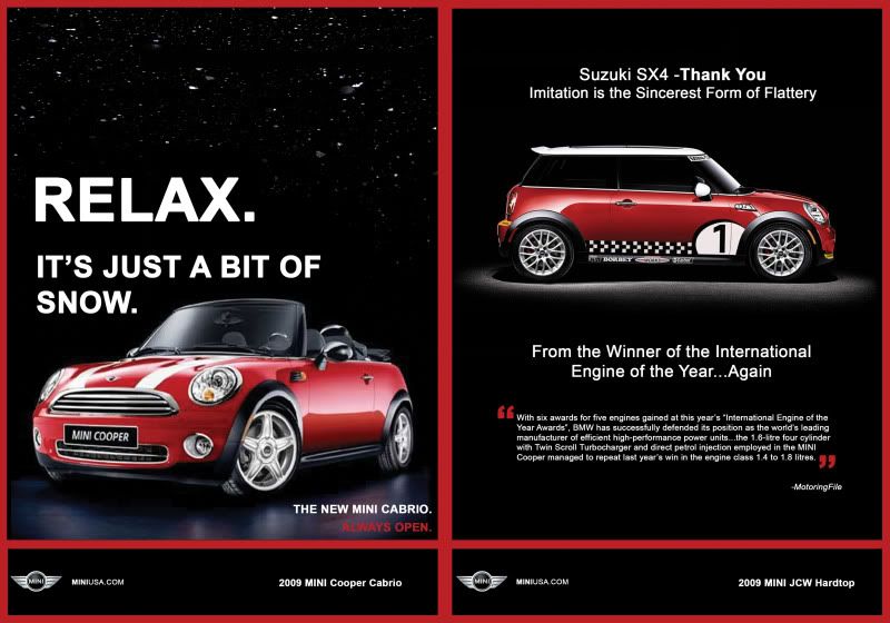
So would it be known as the "MINI Cooper JCW Hardtop" ? or can I just name it "MINI Cooper JCW"
Sorry if I got it wrong, I'm not that updated on the current model's names. I'll def. fix it. It's a easy fix.
I did increase the size of that font...hopefully it's easier to read now?
Sorry if I got it wrong, I'm not that updated on the current model's names. I'll def. fix it. It's a easy fix.
I did increase the size of that font...hopefully it's easier to read now?
#41
04-06-2009, 03:31 PM
#42
04-06-2009, 04:47 PM

Also, whether it's a cabrio(let) or a convertible, you should keep it consistent. Keeping with the consistency theme, you should either put periods after both model names at the bottom right or leave the periods out on both, and perhaps capitalize the model names (MINI likes to use a lot of capitals, as I'm sure you've noticed). It'd improve the ad on the right if you found a font that "fits" the MINI character more (less "Microsoft Word" feeling, if you get what I mean).
Other than that... looks awesome! While I'm not sure whether the one on the right could make it to print, I can definitely imagine the snow ad in a magazine.
Other than that... looks awesome! While I'm not sure whether the one on the right could make it to print, I can definitely imagine the snow ad in a magazine.
#44
04-06-2009, 06:05 PM

6th Gear
Join Date: Jan 2008
Location: Huntsville, AL
Posts: 1,145
Likes: 0
Received 0 Likes
on
0 Posts
#45
04-06-2009, 06:28 PM
#47
04-06-2009, 06:46 PM

I'm late to the game here, but I'm sr. art director at an ad agency, so maybe you'll find my two cents useful. My first question is why is it two separate ads? I think you could do something with much more impact if you treat the entire thing as a single ad. To me the two separate ads side by side looks like it was either a mistake by the publication, or the client (MINI in this case) was two cheap to pay their agency to do a new spread ad and instead ran two existing ads to save money on the creative. If a company is going to run two ads in the same pub, it would have more impact if they ran them on consecutive pages, or in different places throughout the magazine (MINI actually does this a lot with fractional ads).
That said, the Cabrio ad is nicely done. I'd bring "of" down to the second line to get rid of the widow and reduce the size of that text block just a little so that the "It's just a bit" line is the same width as "Relax" without the period. Also, "Always open" is a bit hard to read. I'd darken the reflection behind it a little. Otherwise, this is a fine single page ad.
The Suzuki ad doesn't look like an ad at all. The back of a postcard, maybe. But it's not an ad. I don't like either headline. The thank you headline doesn't make sense unless you have seen the Suzuki ad, and I wouldn't assume that your audience has. The congratulations line just isn't very powerful. I'm not sure whether it is supposed to be sarcasm or snark or honest congratulations, and the third place finish for the MINI only helps to confuse things. The quotes are too long, and unless they are from a source like Motor Trend that a general audience is going to recognize, it's not worth it. It's like seeing an ad for a movie in the New York times featuring a rave review from some paper in Iowa that nobody has ever heard of.
If you're committed to this concept, you could use "Imitation is the sincerest form of flattery" by itself as your headline, and write some copy along the lines of "These days, it seems like everyone wants to compare themselves with MINI. And we don't blame them. After all, we've collected more awards than we can stuff into a Clubman. And that's a lot of stuff..." I'd also recommend going with the larger all-caps font for the headline for consistency between the two ads (and if you use the clubman line, maybe feature a Clubman). If you can find enough awards that mini has won, you could just list them as running text in like 24pt bold text and screen it back to like 10% and fill the entire page, letting the type run off the edges (behind the red frame, and behind the car).
If I were you though, I'd ditch the second ad entirely and tweak the layout of the cabrio ad to fill the whole spread.
#48
04-06-2009, 06:50 PM
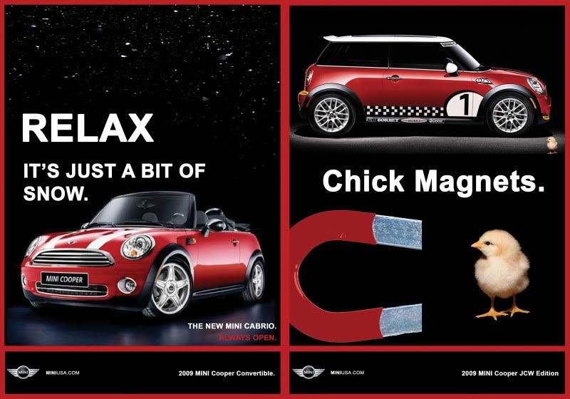
Just saw the chick magnets ad. I like it better than the Suzuki concept.
I'd make the magnet the main image, rotate it a little and then flip the chick upside down and attach it to one end of the magnet. Make that fill the majority of the ad, and run "CHICK MAGNET" in all caps below with a tiny mini as punctuation, the same size as the text.
I'd make the magnet the main image, rotate it a little and then flip the chick upside down and attach it to one end of the magnet. Make that fill the majority of the ad, and run "CHICK MAGNET" in all caps below with a tiny mini as punctuation, the same size as the text.
#49
04-06-2009, 06:52 PM
#50
04-06-2009, 06:55 PM
The problem is, designing the two page ad, I have to keep in mind of the "gutter" the crease in the middle of the magazine page.
Your input is amazing though and def. helpful. I wish I had the talent to be able to pull off everything you mentioned, but I've taken no graphic design courses, and learned Photoshop by myself a couple semesters back. After my class hammering tomorrow, I'll def. go over it again with your comments in consideration.
I think I'm def. going to ditch the second ad and maybe tweak my version 2 ad with the "Chick Magnet."
Maybe I'll ditch the whole idea all together and do a full page ad with the "Relax, it's just snow" idea, but I need to find a large and good quality pic of a 09 MINI Cabrio in a black background to crop it out and use...
But thanks for the input though. Your input is greatly appreciated.