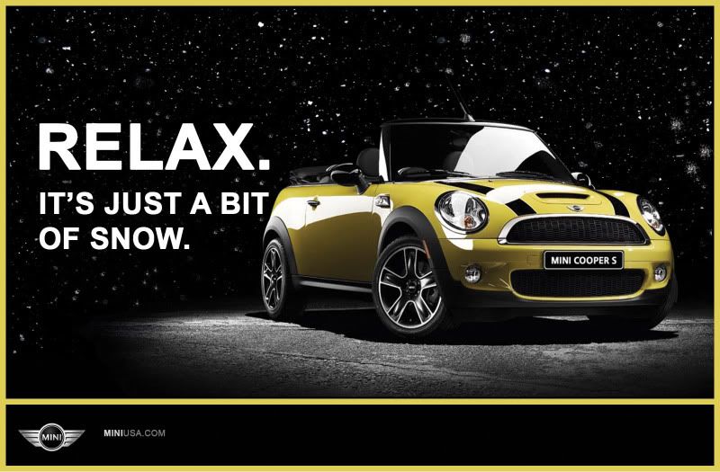
My MINI Cooper 2-page spread magazine advertisement
#51
Just saw the chick magnets ad. I like it better than the Suzuki concept.
I'd make the magnet the main image, rotate it a little and then flip the chick upside down and attach it to one end of the magnet. Make that fill the majority of the ad, and run "CHICK MAGNET" in all caps below with a tiny mini as punctuation, the same size as the text.
I'd make the magnet the main image, rotate it a little and then flip the chick upside down and attach it to one end of the magnet. Make that fill the majority of the ad, and run "CHICK MAGNET" in all caps below with a tiny mini as punctuation, the same size as the text.
I'm not sure what you mean here by using a tiny MINI as punctuation? Rotate the magnet so it's pointing down? Corner? Hmm?
The problem is, designing the two page ad, I have to keep in mind of the "gutter" the crease in the middle of the magazine page. I wouldn't know how to photoshop around that.
Your input is amazing though and def. helpful. I wish I had the talent to be able to pull off everything you mentioned, but I've taken no graphic design courses, and learned Photoshop by myself a couple semesters back. After my class hammering tomorrow, I'll def. go over it again with your comments in consideration.
I think I'm def. going to ditch the second ad and maybe tweak my version 2 ad with the "Chick Magnet." If I do, I'll def. increase the gutter.
Maybe I'll ditch the whole idea all together and do a full page ad with the "Relax, it's just snow" idea, but I need to find a large and good quality pic of a 09 MINI Cabrio in a black background to crop it out and use...
But thanks for the input though. Your input is greatly appreciated especially from a experienced pro like you...stopping by Boston anytime soon? I'll buy you coffee.

Last edited by MrCooperS; 04-06-2009 at 08:04 PM.
#52
No problem. I think your photoshop work looks fine here, at least at the size you've posted. And the typography is nice too (though for a typography final, I guess it should be  ).
).
As far as the gutter goes, if you find a big image, you could stretch the car across the whole spread and not worry too much about it. just make sure that you don't run any words across the center. If you arrange the type so that the center falls on a space, you can just make that space bigger (around a half-inch or so) than the others and you should be fine.
Also, they're not on black, but here are some big cabrio images that would be pretty simple to knock out if you're comfortable with the pen tool:
one
two
 ).
).As far as the gutter goes, if you find a big image, you could stretch the car across the whole spread and not worry too much about it. just make sure that you don't run any words across the center. If you arrange the type so that the center falls on a space, you can just make that space bigger (around a half-inch or so) than the others and you should be fine.
Also, they're not on black, but here are some big cabrio images that would be pretty simple to knock out if you're comfortable with the pen tool:
one
two
#53
As far as the magnet, I don't know. I wouldn't point it up or down. I'd just stick the chick on the end and then scale/rotate it until it looks nice and fills most of the space. Maybe crop the butt off? Just something to make it a little more dynamic than just the straight horizontal alignment.
#55
Sorry. They worked for me. If you go to http://www.leftlanenews.com/ and search for mini convertible, there will be a bunch of articles listed. Most of them have photo galleries at the bottom, and you can blow up the photos to 2400px.
To cut out images, you basically use the pen tool to trace a line around the image. Then when your path is complete, there is an icon at the bottom of the path palette that looks like a dotted circle - the tool tip says something like "load selection from path" Just select your path and then click that button, and it should turn it into a selection. You can then copy and paste the car onto a new layer (you may have to select inverse first depending on your settings). Or, for a little more control, don't copy and paste. Instead, switch to the layers palette, select your photo layer (make sure it isn't the background), and click the "make layer mask" icon (the white square with a circle in it. This will make a mask that you can edit with the paint brush.
You can read about layer masks here: http://creativecurio.com/2008/04/mas...s-layer-masks/
Here is a good overview of the whole pen tool/clipping mask process: http://www.graphic-design-employment...ing-paths.html
Last edited by artmem; 04-06-2009 at 08:53 PM. Reason: added a link.
#56
#59
My First Perfect Crop
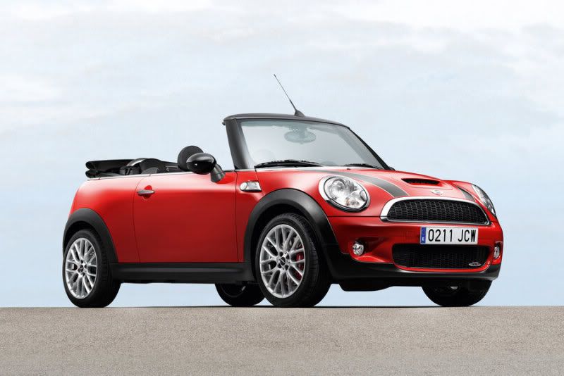
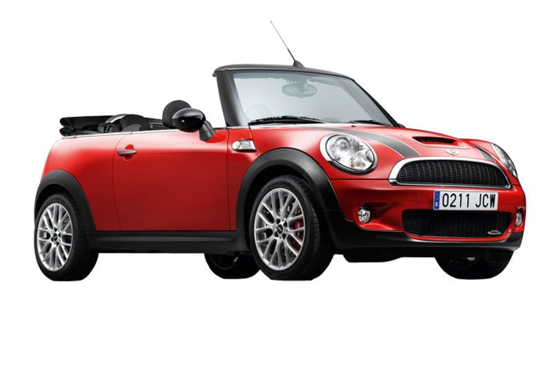
oh man, artmem, you added a powerful tool in my tool belt. with this new skill, my next projects are going to be dangerous! instead of settling for the "ok" image with a black background, I can find the perfect image and crop it out with confidence. Amazing. Thanks a lot artmem.

#62
#63
If you need to blend the windshield, you can knock out just the transparent part (don't include the rearview mirror and sun visors that you can see through the glass) and put it on its own layer. Then adjust the opacity and blend mode (the dropdown menu at the top of the layers palette) to make it look more realistic. What blend mode option works best will depend on the background and what is on the windshield, so experiment with different options and opacities.
#64
It seems to me that buying a car and a Mini in particular, is not merely buying yet another commodity item. The Suzuki ads try to make the argument that a car is a car is a car, therefore might as well buy the one that pound-for-pound is the cheapest. Please don't get me wrong, I'm not knocking the Suzuki product(s), however successful manufacturers like Mini, don't typically get into a feature set comparison. Rather they focus their marketing dollars on creating an image and evoking a feeling about buying/owning their vehicle. As my kids say you can't put a price on cool.
When you start to mention the competition in your ads, you start to delve into the area of feature comparison, which I doubt Mini would ever win. It doesn't have the most trunk space, horse power, most cup holders or lowest price of any other car in its market segment. It doesn't have to; it's a Mini, that's all that needs to be said.

#68
Its beautiful. If you are going to actually put it in a magazine. You need to be aware of where the fold is going to be. I love the simplicity and color. Maybe cause I am wearing yellow and black today. (hmmm). Anyway, you may want to put "Mini Cooper '09 Convertible" or something just to name it.
Do a BRG ad next!
Do a BRG ad next!
#69
#75
WOW! You've really put yourself out there for criticism! Good for you.
I'm glad that you got rid of the Suzuki thing because when I first read it, I felt like that was the car a person SHOULD buy... thankfully, I know better!
When I see this snow ad, I think...
CHILL...
Bring on the SNOW!
(or something like that)
Perhaps I am a bit more confrontational with snow! Or maybe it has something to do with being a big dog in a little dog body?
Good luck on your project!
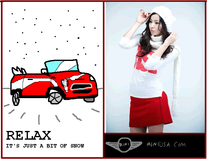
Nabeshin- that IS a nice paint pic of the car that you did.

I'm glad that you got rid of the Suzuki thing because when I first read it, I felt like that was the car a person SHOULD buy... thankfully, I know better!

When I see this snow ad, I think...
CHILL...
Bring on the SNOW!
(or something like that)
Perhaps I am a bit more confrontational with snow!
 Or maybe it has something to do with being a big dog in a little dog body?
Good luck on your project!

Nabeshin- that IS a nice paint pic of the car that you did.


